
Weighted A/D User Notes
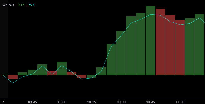
Weighted Histogram vs Unweighted Line
The red and green histogram is the cumulative total of the 11 S&P subsectors weighted as according to their proportionate composition in the S&P. The line is the cumulative total of those same sectors equally weighted.
The S&P updates it’s sector weightings monthly. For an up to date list of the S&P sector weightings, visit the S&P’s website.
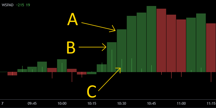
A = B + C
The narrow red and green lines are the non-cumulative bar by bar change in the weighted cumulative histogram.
They are the amount which the weighted subsectors have moved for that candlestick only.
Measured From The Open
Both the weighted histogram and the unweighted line are measured from the open by design.
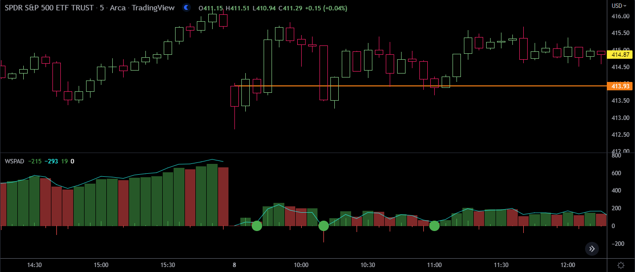
Divergence Circles
Divergence circles appear when there is divergence between the Weighted A/D and the SPY.
Green circles appear when there is bullish divergence - that’s when the Weighted A/D is above 0 and the SPY is below it’s opening price (the orange line in the image above).
Red circles appear when there is bearish divergence - that’s when the Weighted A/D is below 0 and the SPY is above it’s opening price.